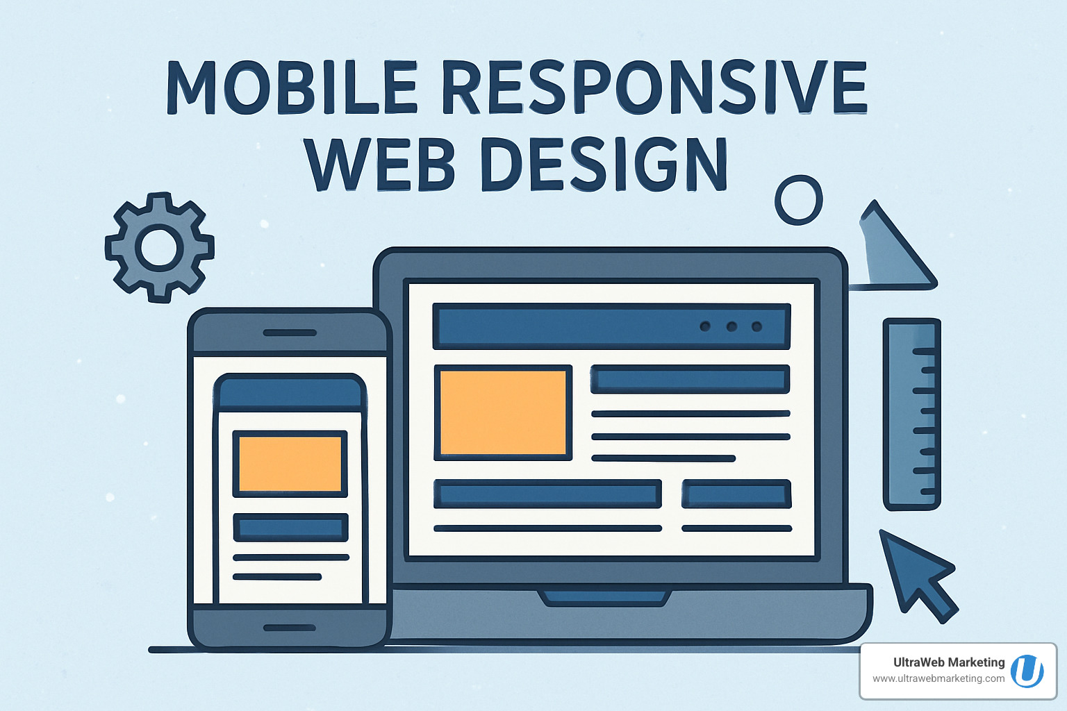
Why Your Business Needs Mobile Responsive Web Design Today
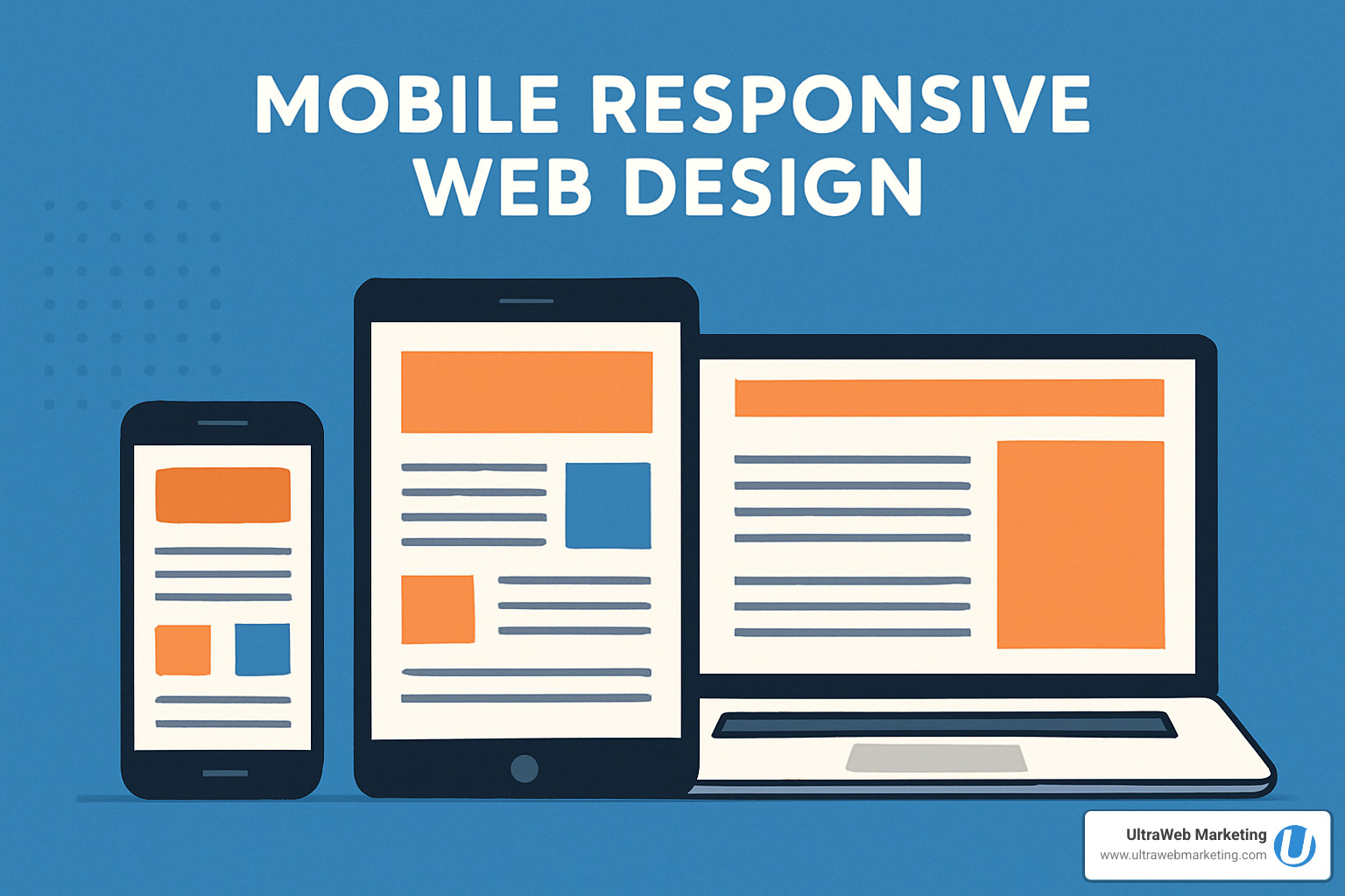
Mobile responsive web design is a web development approach that creates websites that automatically adapt their layout, content, and functionality to work perfectly on any device – from smartphones to tablets to desktop computers. Here’s what you need to know:
Key Components:
- Fluid grids that resize based on screen width
- Flexible images that scale without breaking
- CSS media queries that apply different styles for different devices
- Viewport meta tag that controls mobile scaling
Why It Matters:
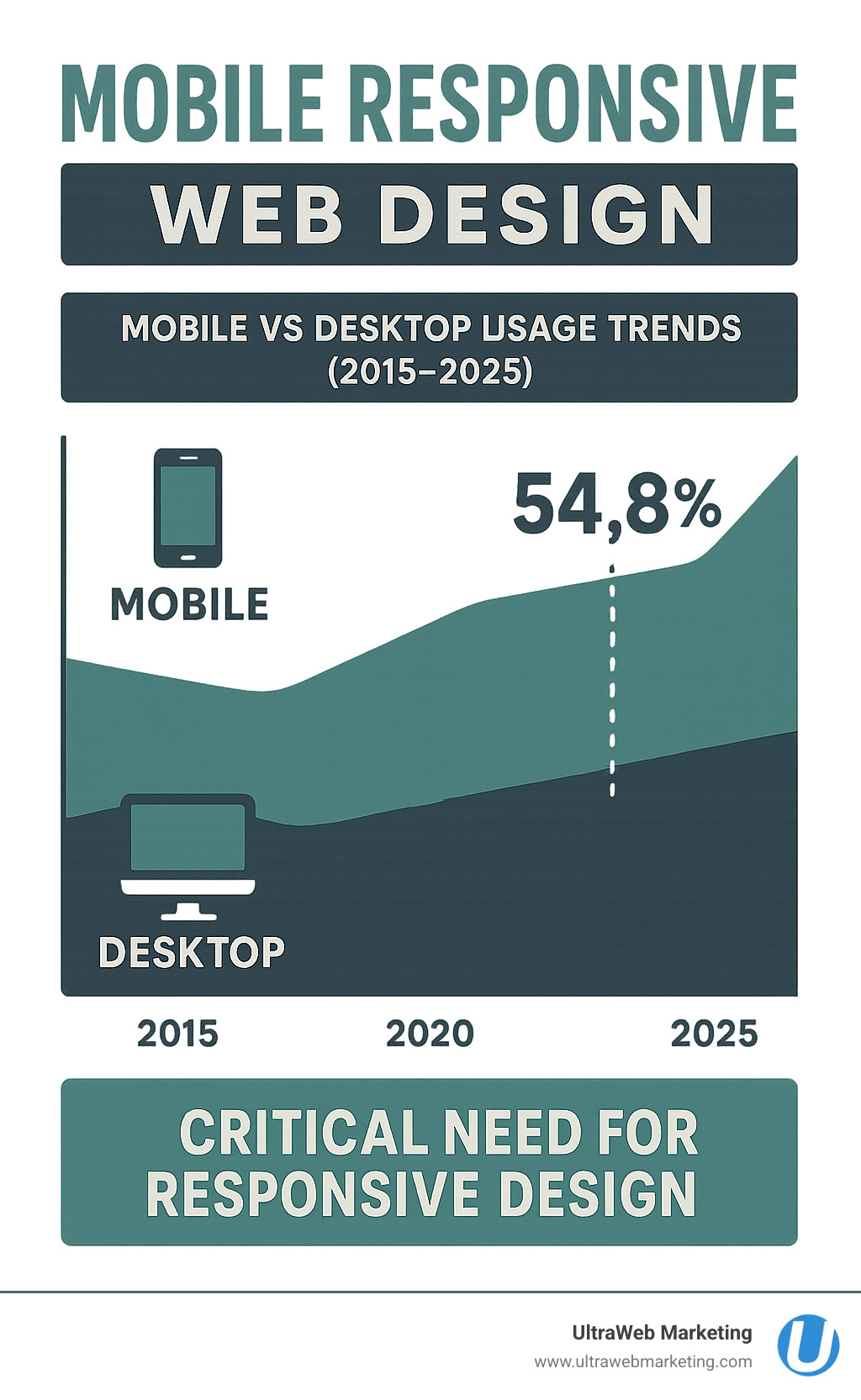
- Over 54% of web traffic comes from mobile devices
- Google uses mobile-first indexing for search rankings
- Non-responsive sites lose customers and revenue
- One website works everywhere (no separate mobile site needed)
Think about it – when was the last time you visited a website on your phone that made you pinch and zoom just to read the text? Frustrating, right? That’s exactly what happens when businesses don’t have mobile responsive web design.
The numbers don’t lie. Mobile devices now generate the majority of website traffic, and Google has been prioritizing mobile-friendly sites since 2015. If your website doesn’t work well on phones and tablets, you’re literally pushing potential customers away.
I’m Damon Delcoro, founder and CEO of UltraWeb Marketing, and I’ve helped countless Florida businesses transform their digital presence through mobile responsive web design strategies that actually work. After growing our in-house e-commerce business to over $20 million annually and consistently placing local businesses on Google’s first page, I’ve seen how proper mobile responsive web design can make or break a business’s online success.
What Is Responsive Web Design & Why It Matters
Picture this: you’re running a successful business in Florida, and a potential customer finds your website on their phone while waiting in line at Starbucks. They try to read about your services, but the text is tiny, the buttons are impossible to tap, and they have to pinch and zoom just to see your phone number. Frustrated, they close your site and find your competitor instead.
This is exactly what mobile responsive web design prevents from happening to your business.
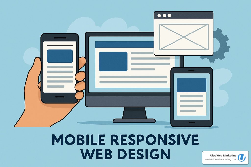
Mobile responsive web design is a web development approach that creates websites that automatically adjust their layout, images, and functionality to work perfectly on any device – whether it’s a smartphone, tablet, or desktop computer. Think of it like having a website that’s a shape-shifter, intelligently adapting to whatever screen it finds itself on.
The concept was pioneered by web designer Ethan Marcotte back in 2010, and it quickly revolutionized how we build websites. Instead of creating separate versions for different devices, responsive design uses fluid grids that resize based on screen width, flexible images that scale without breaking, and CSS media queries that apply different styling rules for different screen sizes. The viewport meta tag tells mobile browsers exactly how to display your site for the best user experience.
Here’s why this matters tremendously for your Florida business: 61% of users won’t return to a website they had trouble accessing on mobile. Even more importantly, Google now uses mobile-first indexing, which means they primarily look at the mobile version of your site when determining search rankings. If your website doesn’t work well on phones and tablets, you’re not just losing customers – you’re losing visibility in search results too.
The beauty of responsive design is that you maintain just one website that works everywhere, saving you money and eliminating the headache of managing multiple versions. For the technical details and origins of this approach, you can dive into this scientific research on responsive design origin.
Mobile Responsive Web Design vs. Early Mobile Sites
Remember the old days when businesses had separate mobile websites with URLs like m.yoursite.com? Or when sites tried to guess what device you were using and sometimes got it completely wrong? Those approaches created more problems than they solved.
These early mobile sites relied on mobile-only m-dot subdomains and user-agent sniffing to detect devices, but they came with significant drawbacks. The maintenance overhead was enormous – every change had to be made twice, and keeping content synchronized was a nightmare. From an SEO perspective, these separate sites often created duplicate content issues and split your website’s authority across multiple domains.
Today’s mobile responsive web design eliminates all these headaches by doing the smart work in one place. Here’s how the different approaches stack up:
| Approach | Ease of Maintenance | SEO | User Experience | Cost |
|---|---|---|---|---|
| Responsive (RWD) | Easy (single site) | Great | Seamless | Efficient |
| Adaptive | Moderate | Good | Good | Moderate |
| Separate Mobile Site | Difficult | Poor | Inconsistent | Expensive |
At UltraWeb Marketing, we’ve helped countless Florida businesses transition from outdated mobile sites to modern responsive designs that actually work. The difference in user engagement and search rankings is remarkable – it’s like giving your business a digital makeover that pays for itself through increased customer conversions and better Google visibility.
Core Principles & Techniques of Mobile Responsive Web Design
Building a website that works beautifully on every device isn’t rocket science—it’s about understanding a few key principles and applying them thoughtfully. At UltraWeb Marketing, we’ve perfected these techniques over a decade of helping Florida businesses create websites that actually convert visitors into customers.
The foundation of mobile responsive web design starts with thinking fluid, not fixed. Instead of creating rigid layouts that break on different screens, we build websites that flow and adapt naturally.
Flexible Grids & Layout Tools
Think of a flexible grid like a smart accordion—it expands and contracts to fit whatever space it’s given, but always maintains its structure and proportions.
The secret sauce is using percentage-based columns and modern CSS tools like Flexbox and CSS Grid. These aren’t just fancy buzzwords—they’re the workhorses that make your content look organized whether someone’s viewing it on a massive desktop monitor or squinting at their phone screen.

Here’s what makes the difference: Flexbox works perfectly for simple layouts like navigation bars or button groups, while CSS Grid shines when you need more complex arrangements like photo galleries or multi-column content areas. The fr unit (fractional unit) divides available space proportionally, so your layout always looks balanced.
Media Queries & Breakpoints That Work
Media queries are like having a conversation with each visitor’s device. Your website asks, “How wide is your screen?” and then serves up the perfect layout for that size.
The magic happens with min-width strategy—starting with mobile and adding improvements as screens get larger. Common breakpoints we use include 480px for phones, 768px for tablets, and 1024px for desktop. But here’s the pro tip: use em-based queries instead of pixels for better flexibility.
We also test for orientation changes because people flip their phones constantly. Your Florida restaurant’s menu should look great whether someone’s holding their phone upright or sideways while deciding what to order.
For the technical deep-dive, check out this scientific research on media queries.
The <meta viewport> Secret Sauce
This tiny line of code is the unsung hero of mobile responsive web design:
<meta name="viewport" content="width=device-width, initial-scale=1">
Without it, mobile browsers assume your site was built for desktop and shrink everything down to fit. With it, your site displays at the proper size and lets all your responsive magic work correctly. It’s like giving your website permission to be mobile-friendly.
The width=device-width part tells the browser to match the screen’s width, while initial-scale=1 prevents unwanted zooming. You can control pinch-zoom behavior too, though we usually leave that enabled for accessibility.
Mobile-First Strategy
Here’s where many businesses get it backwards. They design for desktop first, then try to cram everything onto mobile screens. That’s like trying to fit a king-size bed into a studio apartment—it just doesn’t work.
Mobile-first design starts with the smallest screen and builds up. This forces you to prioritize your most important content and create a clear content hierarchy. You’ll naturally end up with faster load times because you’re working within a performance budget from day one.
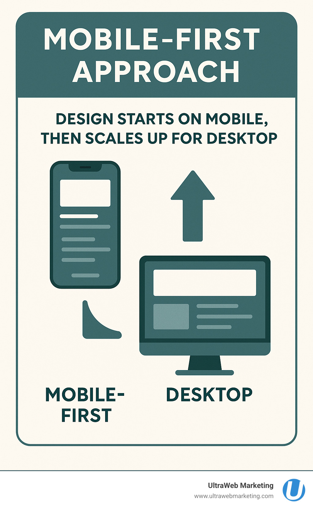
The graceful improvement approach means your site works perfectly on basic phones, then gets improved features on tablets and desktops. Every Florida business owner should understand this—your customers are probably finding you on their phones first.
Want to dive deeper into mobile-friendly strategies? Here’s more info about mobile friendly websites.
Responsive images use techniques like srcset and the picture element to serve the right image size for each device. Nobody wants to wait for a massive desktop image to load on their phone data plan. SVG icons scale perfectly at any size and load lightning-fast.
For responsive typography, we use relative units like rem, em, and viewport units (vw) so text scales beautifully. The clamp() function lets us set minimum and maximum sizes with fluid scaling in between. Body text should never be smaller than 16px on mobile—your visitors’ eyes will thank you.
Progressive improvement means building in layers. Start with a solid foundation that works everywhere, then add advanced features for devices that can handle them. This approach ensures your website reaches the widest possible audience across Florida and beyond.
Finally, accessibility isn’t optional—it’s essential. We ensure sufficient color contrast for readability, alt text for images, and keyboard navigation support. Touch targets need to be at least 44×44 pixels following Fitts’ Law principles, so people can actually tap your buttons without frustration.
Implementing & Testing Mobile Responsive Web Design
Building a mobile responsive web design is just the beginning—making sure it actually works flawlessly on every device is where the real magic happens. At UltraWeb Marketing, we’ve learned that thorough testing can make the difference between a site that looks good in theory and one that actually converts visitors into customers.
Testing Responsiveness
You might think you need a whole collection of phones and tablets to test properly, but honestly, you don’t need to break the bank buying every device on the market. Here’s how we make sure our Florida clients’ websites work perfectly everywhere.
Chrome DevTools is your best friend for initial testing—it’s like having dozens of devices right inside your browser. You can simulate everything from the latest iPhone to older Android tablets without leaving your desk. BrowserStack takes it a step further by letting you test on actual devices in the cloud, which is especially helpful for catching those quirky bugs that only show up on real hardware.
Don’t forget about Lighthouse audits—these automated reports give you instant feedback on performance, accessibility, and SEO. It’s like having a website inspector that never gets tired of checking your work.
Here’s a pro tip from our years of experience: always test in both portrait and landscape modes. You’d be surprised how many layouts completely fall apart when someone rotates their phone to watch a video or fill out a form.
Choosing Tools for Mobile Responsive Web Design
The good news is you don’t have to build everything from scratch. There are fantastic tools that can speed up your mobile responsive web design process while still giving you professional results.
Bootstrap remains a solid choice—it’s a pre-built, mobile-first CSS framework with a robust grid system that just works. Tailwind CSS is perfect if you want more control over your design without writing everything from scratch. For businesses that need something up and running quickly, WordPress with modern themes can provide responsive design right out of the box.
Sometimes, though, custom CSS is the way to go, especially when you need maximum flexibility and performance. That’s where our team at UltraWeb Marketing really shines—we know when to use each tool and how to customize them for your specific business needs.
Want to learn more about how we approach this? Check out our web design services to see how we can help your Florida business get online the right way.
Show-Hide & Progressive Disclosure Patterns
Here’s something many businesses get wrong: mobile responsive web design isn’t just about making things smaller. Sometimes you need to completely rethink what information is visible on a small screen.
Navigation drawers (those hamburger menus that slide out) keep your site’s navigation accessible without cluttering up the screen. Accordions are perfect for collapsing long sections of content—users can tap to expand what they’re interested in. Smart show-hide logic means hiding non-essential graphics or sidebars on mobile while keeping the important stuff front and center.
Every button and link needs to be big enough for real human fingers—we’re talking at least 44×44 pixels. Nobody wants to play “pin the tail on the tiny button” when they’re trying to contact your business.
Validation & Accessibility Checks
A website isn’t truly finished until it works for everyone—and I mean everyone. Color contrast needs to meet WCAG standards so people can actually read your content. Alt text on images helps screen readers describe what’s happening for visually impaired users. Keyboard navigation ensures people can tab through your forms and links without a mouse.
Most importantly, don’t hide essential content just because someone’s on mobile. Your phone number, address, and key services should be just as easy to find on a smartphone as they are on a desktop computer.
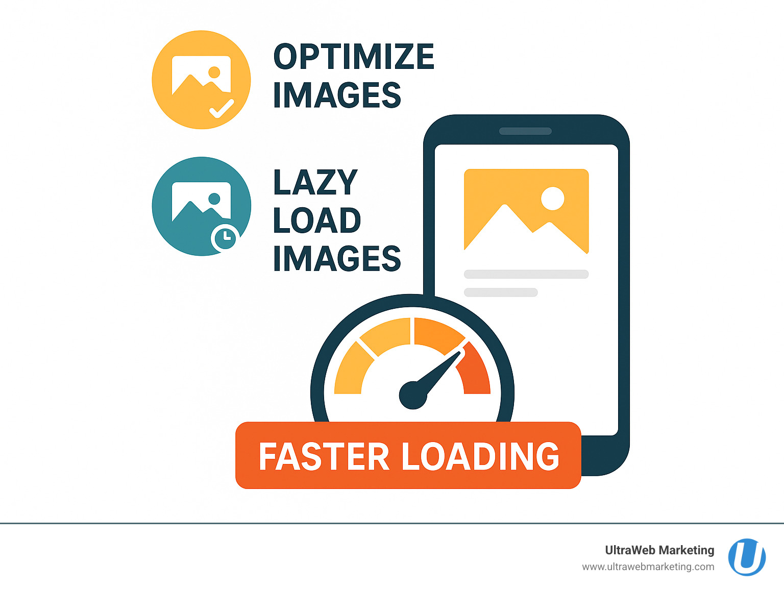
Performance is equally crucial—mobile users in Florida (and everywhere else) are impatient. If your site takes more than three seconds to load, most visitors will bounce to your competitor’s site. Optimized images using modern formats like WebP, lazy loading for offscreen content, and SVG icons that look crisp at any size all contribute to a fast, smooth experience.
This is exactly the kind of detailed work that separates professional web design from DIY attempts. At UltraWeb Marketing, we’ve been helping Florida businesses get these technical details right for over a decade, and it shows in the results our clients achieve.
Performance, SEO & Future Trends
Here’s the thing about mobile responsive web design – it’s not just about making your site look good on phones. It’s about making sure your Florida business actually gets found by customers and keeps them engaged once they land on your site.
Google’s Core Web Vitals have changed the game completely. These metrics – how fast your site loads, how quickly users can interact with it, and how stable the visual layout is – now directly impact your search rankings. If your site takes forever to load on mobile or jumps around while loading, Google notices and your rankings suffer.
We’ve seen this with our clients. When we rebuild a slow, non-responsive site with proper mobile responsive web design, businesses often see their Google rankings improve within weeks. It’s not magic – it’s just giving users (and Google) what they want.
Responsive images via CDN are a game-changer for performance. Instead of forcing a phone to download a massive desktop image, smart sites serve the perfect size for each device. This can cut load times in half, especially on slower mobile connections.
Modern web technologies like HTTP/2 and client hints are making sites even faster. These work behind the scenes to deliver content more efficiently, but they work best when your site is properly responsive from the ground up.
Looking ahead, container queries are coming soon to give designers even more control over how layouts adapt. Think of it as media queries on steroids – elements can respond to their container size, not just the screen size.
AI-powered layout assistants are already helping designers test thousands of layout variations automatically. These tools use machine learning to figure out which designs convert best for different audiences and devices.
The future is getting even more interesting with voice and AR interfaces. We’re starting to see websites that work without any touching at all – just voice commands or augmented reality overlays. While this might sound futuristic, forward-thinking Florida businesses are already exploring these technologies.
For local businesses in South Florida, staying ahead of these trends isn’t just nice to have – it’s essential for competing online. Our digital marketing plans start as low as $649 per month, and we make sure every site we build is ready for both today’s users and tomorrow’s technology.
Want to understand why this matters for your specific business? Check out the importance of a mobile responsive website for more details on how responsive design directly impacts your bottom line.
Frequently Asked Questions about Mobile Responsive Web Design
How many breakpoints do I really need?
Here’s the truth: you don’t need a breakpoint for every device that’s ever been made. I’ve seen business owners get overwhelmed thinking they need to design for dozens of different screen sizes, but that’s just not how mobile responsive web design works.
Start simple with three to five key breakpoints that cover the major device categories. Think about it like this: small screens (phones around 480px-600px), medium screens (tablets at 768px), and large screens (desktops at 1024px and up).
The secret sauce? Let your content guide you, not device specifications. Add a breakpoint when your layout starts looking cramped or awkward, not because you found a list of every iPhone screen size online. Your Florida customers care about whether your site works well on their phone—they don’t care if you’ve optimized for 47 different devices.
Do I still need an app if my site is responsive?
This is one of the most common questions I get from South Florida business owners, and the answer might surprise you: probably not.
A well-built mobile responsive web design can handle most business needs beautifully. Whether you’re running an e-commerce store, booking appointments, or generating leads, a responsive website often does the job better than an app. Your customers can find you through Google, share your link easily, and access your services without downloading anything.
Mobile apps make sense when you need features like push notifications, offline functionality, or deep integration with phone features like the camera or GPS. But for most local Florida businesses? A fast, responsive website is your best investment.
Think about your own phone habits. How many business apps do you actually have installed versus how many business websites you visit through your browser? Your customers behave the same way.
Will responsive design hurt my desktop experience?
Absolutely not—and here’s why this concern comes up so often. Some business owners worry that focusing on mobile will make their desktop site look stripped down or basic. In reality, mobile responsive web design makes your desktop experience better.
When we build responsive sites at UltraWeb Marketing, we’re not taking away from your desktop design. We’re creating a cleaner, more focused experience that works everywhere. Your desktop visitors get faster load times, better navigation, and layouts that actually make sense.
Here’s what really happens: responsive design forces you to prioritize what matters most to your customers. That means clearer calls-to-action, better organized content, and improved performance across the board. Your desktop users will thank you for it.
The bottom line? Every user deserves a great experience, whether they’re browsing on their phone during lunch or researching on their office computer. Responsive design ensures that happens without compromise.
Conclusion
Here’s what every Florida business owner needs to understand: mobile responsive web design isn’t just a nice-to-have feature anymore—it’s the foundation of your online success. When over half of your potential customers are browsing on their phones, meeting them with a website that works flawlessly on every device is absolutely critical.
Think about your own browsing habits. When you land on a site that’s clunky on mobile, you leave within seconds. Your customers do the same thing. That’s lost revenue, lost leads, and lost opportunities to grow your business.
At UltraWeb Marketing, we’ve spent over a decade helping Florida businesses transform their digital presence through mobile responsive web design that actually drives results. We’re not just building websites—we’re creating powerful platforms that rank on Google, attract new customers, and turn visitors into paying clients.
Our approach is different because we understand that a beautiful website means nothing if it doesn’t help your business grow. That’s why every site we build combines stunning responsive design with proven SEO strategies and conversion optimization. We’ve helped countless businesses across Boca Raton, Delray Beach, Fort Lauderdale, West Palm Beach, Miami, and throughout South Florida dominate their local markets online.
Whether you’re getting online for the first time or your current website is driving customers away, we’re here to help. Our team knows exactly what it takes to build a mobile responsive web design that works as hard as you do. Plus, with our online marketing plans starting as low as $649 per month, professional web design and digital marketing is more accessible than ever.
Ready to give your Florida business the competitive edge it deserves? Learn more about responsive web design for your business, or contact us today for a free consultation. Let’s build something amazing together.
UltraWeb Marketing: Your Local Experts in Mobile Responsive Web Design and SEO-Driven Growth.